Sidepanel
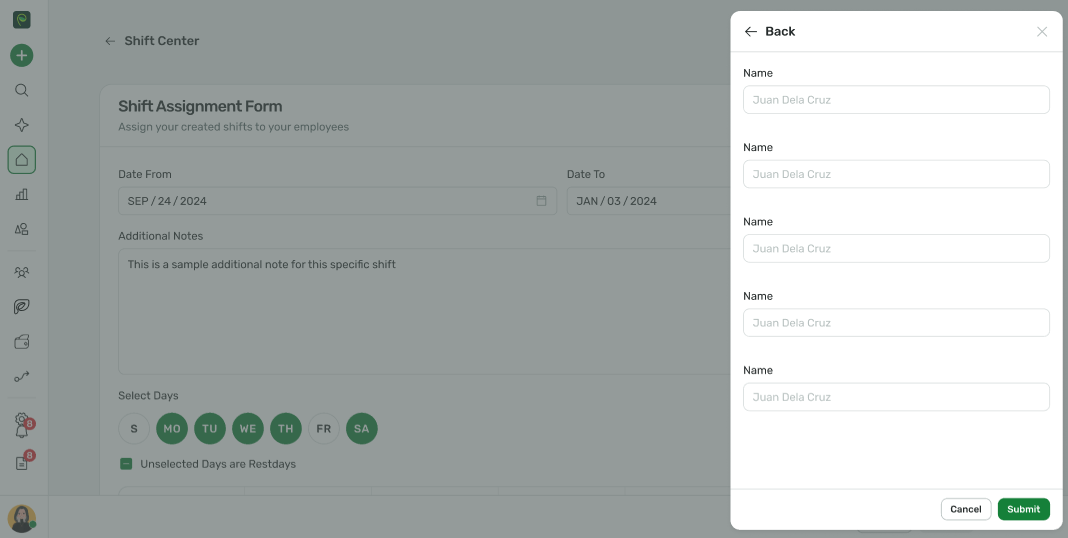
The Sidepanel component is a reusable UI element designed to display contextual or additional information alongside the main content of your application. It slides into view from the edge of the screen, providing a seamless and non-intrusive way to present content such as forms, lists, or detailed views.
Basic Usage
vue
<template>
  <spr-button tone="success" @click="isSidepanelOpen = true">Open Sidepanel</spr-button>
  <spr-sidepanel :is-open="isSidepanelOpen" @close="isSidepanelOpen = false" header-title="Sidepanel Example">
    <div class="p-4">Sidepanel Content</div>
    <template #footer>
      <div class="px-4 flex justify-end gap-2">
        <spr-button>Cancel</spr-button>
        <spr-button tone="success">Submit</spr-button>
      </div>
    </template>
  </spr-sidepanel>
</template>
Size
vue
<template>
  <div class="flex space-x-4">
    <spr-button tone="success" @click="isSmallSidepanelOpen = true">Small</spr-button>
    <spr-button tone="success" @click="isMediumSidepanelOpen = true">Medium</spr-button>
    <spr-button tone="success" @click="isLargeSidepanelOpen = true">Large</spr-button>
  </div>
  <spr-sidepanel
    size="sm"
    :is-open="isSmallSidepanelOpen"
    @close="isSmallSidepanelOpen = false"
    header-title="Sidepanel Small"
  >
    360px
  </spr-sidepanel>
  <spr-sidepanel
    size="md"
    :is-open="isMediumSidepanelOpen"
    @close="isMediumSidepanelOpen = false"
    header-title="Sidepanel Medium"
  >
    420px
  </spr-sidepanel>
  <spr-sidepanel
    size="lg"
    :is-open="isLargeSidepanelOpen"
    @close="isLargeSidepanelOpen = false"
    header-title="Sidepanel Large"
  >
    480px
  </spr-sidepanel>
</template>

<script lang="ts" setup>
import { ref } from 'vue';

const isSmallSidepanelOpen = ref(false);
const isMediumSidepanelOpen = ref(false);
const isLargeSidepanelOpen = ref(false);
</script>
Slot
| Name | Description |
| header | Slot to customize the header content |
| footer | Slot to customize the footer content |
API Reference
| Name | Description | Type | Default |
| isOpen | Controls whether the side panel is open. Set to true to display the side panel or false to hide it. | boolean | false |
| headerTitle | The title displayed in the side panel's header. | string | 'Sidepanel Header' |
| size | Specifies the size of the side panel. | 'sm' | 'md' | 'lg' | 'sm' |
| height | Specifies the height of the side panel. | string | number | 'calc(100vh - 32px)' |
| hideHeader | Controls the visibility of the side panel header. | boolean | false |
| hasBackdrop | Determines whether a backdrop is displayed behind the side panel. | boolean | true |
| closeOutside | Controls whether clicking outside the side panel should close it. | boolean | true |
| @onClose | Function to call when the sidepanel is closed | function | - |
Product Uses


